

It could be running with Strava, hailing a ride with Uber or searching the world’s collective knowledge with Google.
Each of these products are world-class in providing users a low floor and a high ceiling.
What does this mean?
It means they strike a balance between offering a deceivingly simple path to value while enabling them to navigate, explore, and push the product further if they wanted to.
Let’s look at examples from each.
Strava has a big, orange "Start" button.

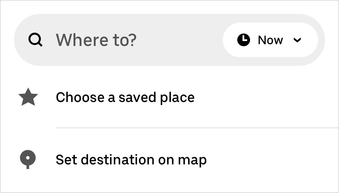
Uber has a "Where to?" field.
Google has a singular search box.

For new users to these products, the first step couldn't be more obvious.
But we all know that these clear first steps are barely scratching the surface of the product's capability.
Though powerful, in each case the product doesn't get in its own way, offering a suggestion but enabling the user to choose their own path.
Finding this balance is quite difficult because you'll often lead to feature scarcity in pursuit of simplicity or feature bloat in pursuit of optionality.
The products that fail to innovate and raise the ceiling in the name of simplicity are the products that often get overtaken by the more robust competitors (I couldn’t think of an example so… point proven 🤷♂️).
And the products that overload your senses in the name of power (eg. Adobe Creative Suite) are the products that lose market share to the simpler, niche experiences (eg. Figma).
Making Product Sense
How Figma Became a $20B Threat
Hey, I’m Jacob ✌️ Welcome to all of the product people who subscribed since last time! If you’re not a subscriber yet, I hope you’ll consider joining this band of like-minded folks who are all learning how to build better products. Questions or feedback…
Read more
2 months ago · 13 likes · Jacob Jolibois
The holy grail is to create an experience that has a low barrier to entry but high-level functionality hidden in plain sight.
Let’s look at an example.
With over 750M users worldwide, Microsoft Excel is quite possibly the most powerful piece of consumer software on the planet.
If you knew nothing else, it would seem that Excel was a ridiculously powerful and complex piece of software that requires years of training to use well. And you would be right... but it's also taught in high school.
How is this possible?
Excel has gone through a lifetime of iteration, expansion, and refinement, but one thing has remained true. When you open a blank spreadsheet for the first time, even the most inexperienced users can get started easily by plugging plain-text information into the cells. Because the list, and its 2-D counterpart, the table, are universal concepts that need no explanation.
But of course, making perfectly formatted lists isn’t all it's good for. Simply typing the equal sign into a cell opens up an entire world of possibilities by allowing you to enter equations and let the software do the math for you. Then your head explodes when you realize that you can reference data in other cells! 🤯
The harder you push the product, the more you find it can do. Data types, pivot tables, macros... an endless menu of possibilities that allow you to do stuff like this.

My company builds business management tools for home service providers. When we were building v1.0 in the beginning, we thought that it made sense to have the user add a client and then add jobs for that client.
But after looking at the data, it was clear that users got the most value out of adding jobs. Retention jumped nearly 50% after a user added a job!
So we made some changes.
This gave our new users a singular focus. A path of least resistance. If they wanted to connect that job to a client later, great! If they wanted to add services to that job later, great! If they wanted to log their time on the job later, great! But we no longer made them jump through so many hoops to get to the value moment.
Designing good products is hard. Designing great products takes years of doubt, struggle, experimentation, intuition and conversation.
I'll see you in the trenches 🫡
—Jacob ✌️